WOODINVILLE WHISKEY
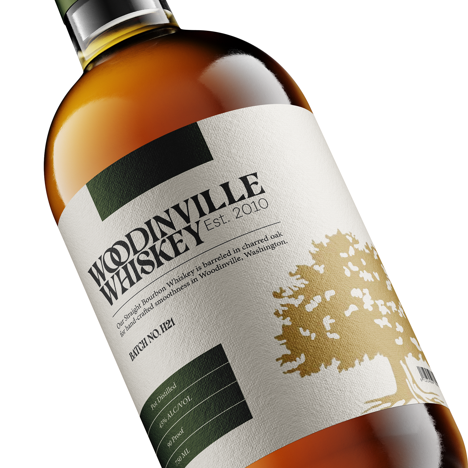
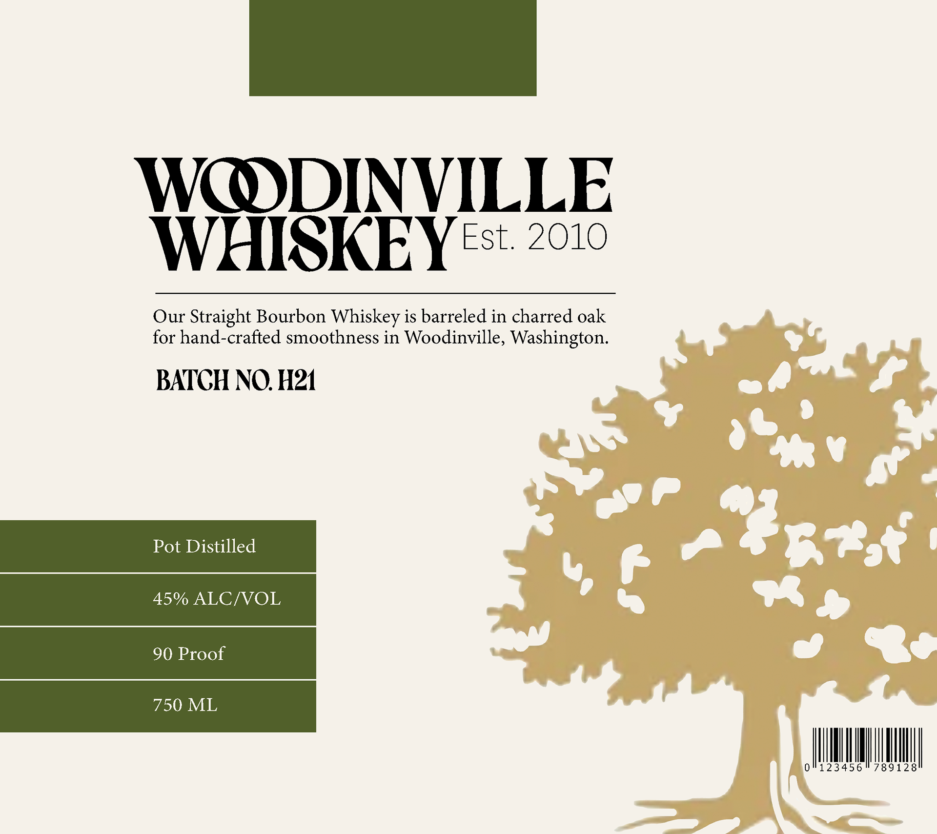
Woodinville Whiskey is a small-batch bourbon company based in Woodinville, Washington, seeking a front label redesign to support their upcoming national expansion and showcase their high quality, classic, small batch whiskey.
TOOLS USED Adobe InDesign, Adobe Photoshop, Adobe Illustrator.
ROLES AND SKILLS Typography, Photo Editing.
PROCESS AND WORK
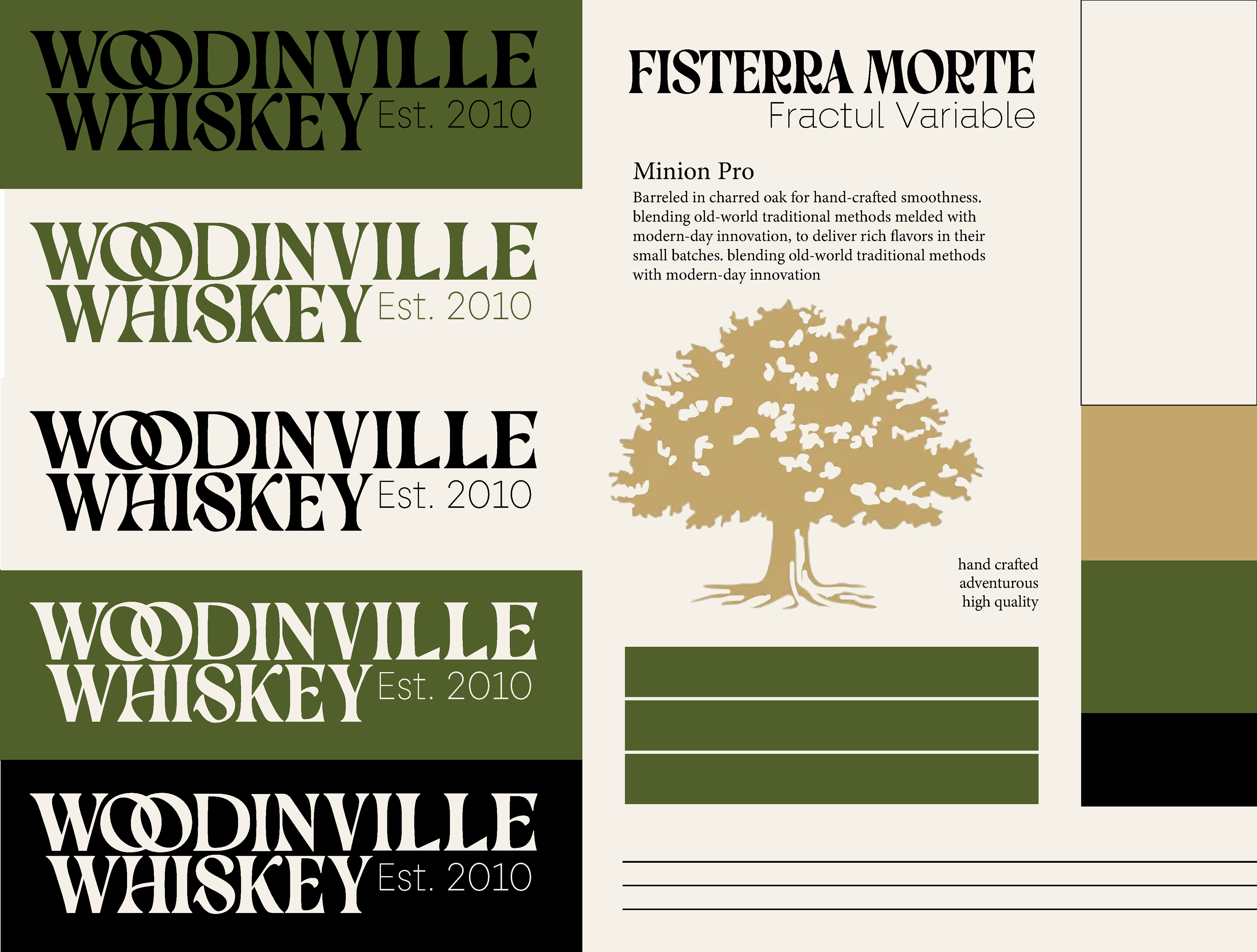
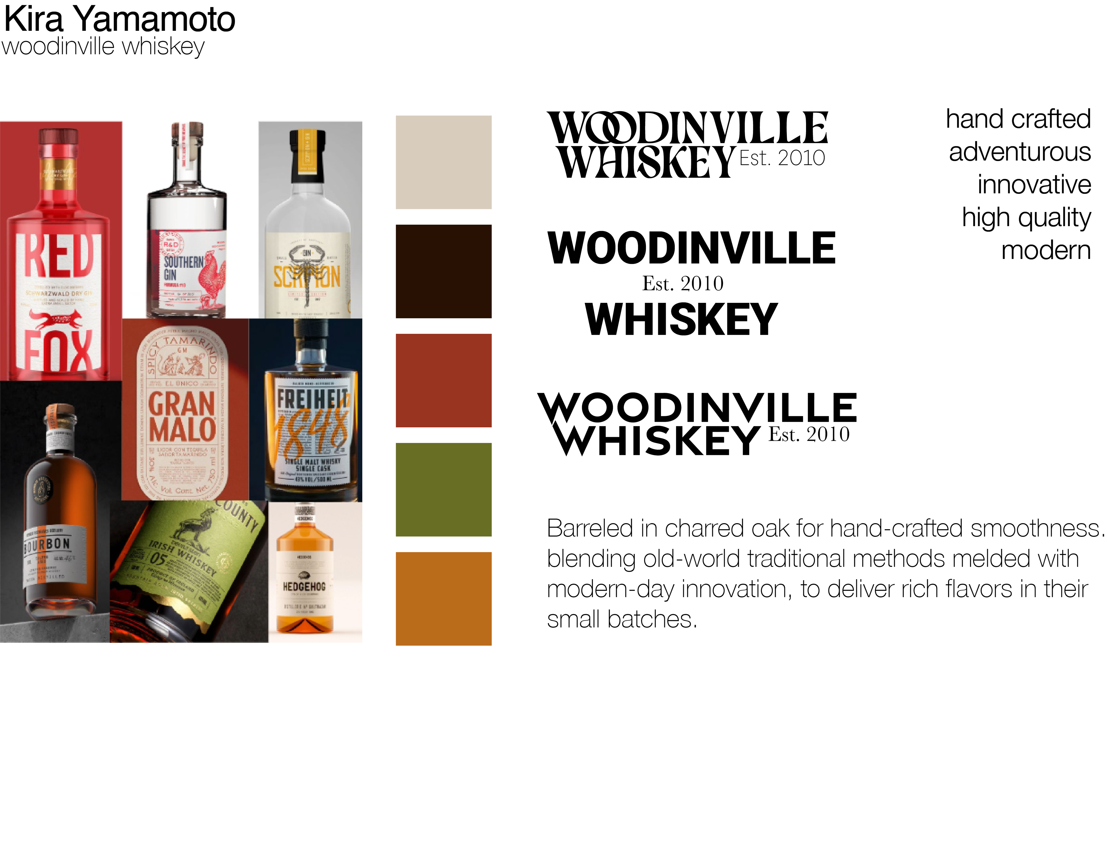
To create a label that would fit well on the shelf alongside other bottles, I gained inspiration from bottles with similar values. Hand crafted, adventurous, and high quality.
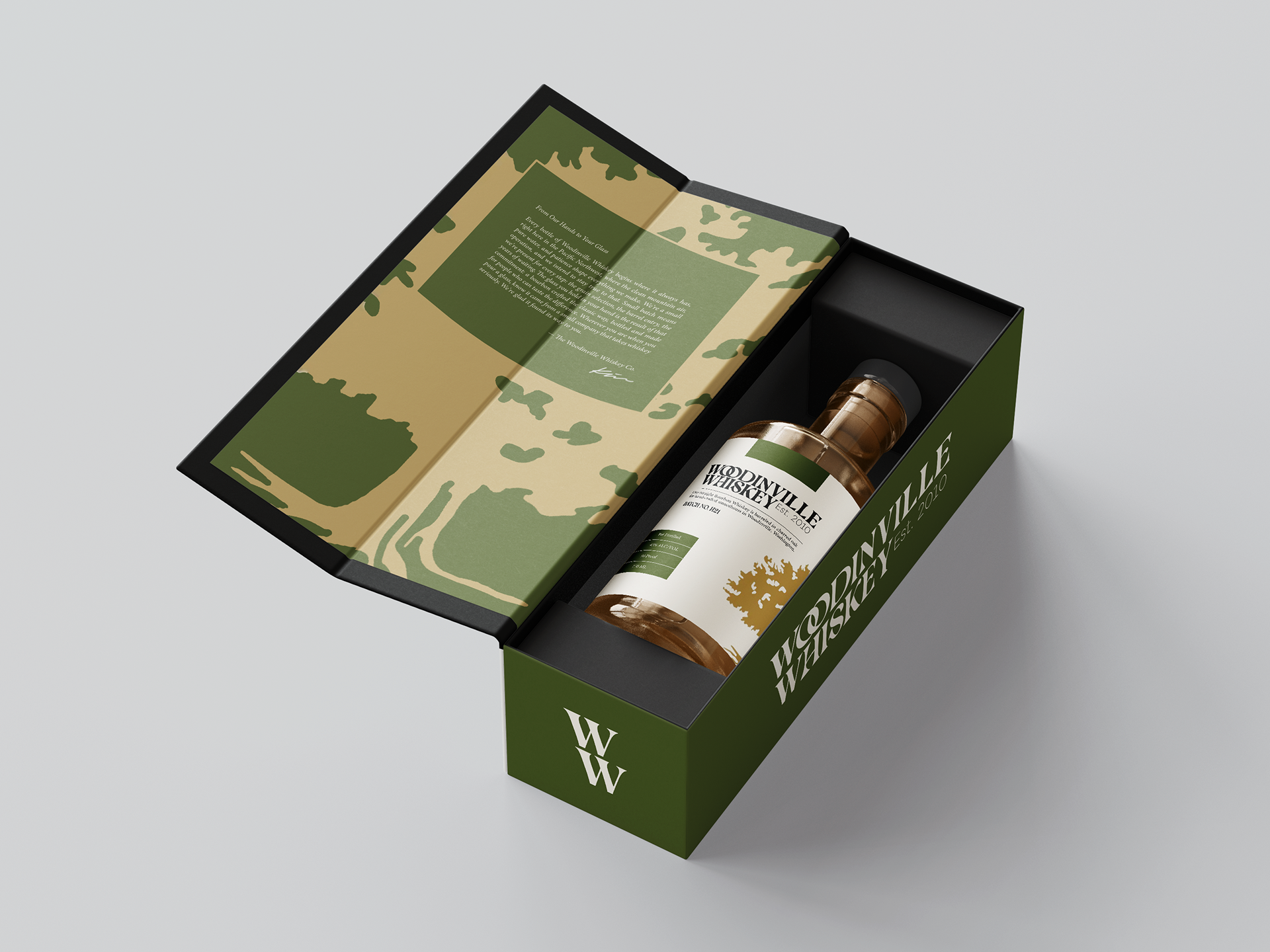
I selected a natural based color palette with a leafy green, which alongside an oak tree, communicates the Pacific Northwest heritage of the brand. It also nods to the fact that it is barreled in charred oak. A rich gold adds a premium and specialized feel. The cream background adds smoothness and enriches the overall palette.
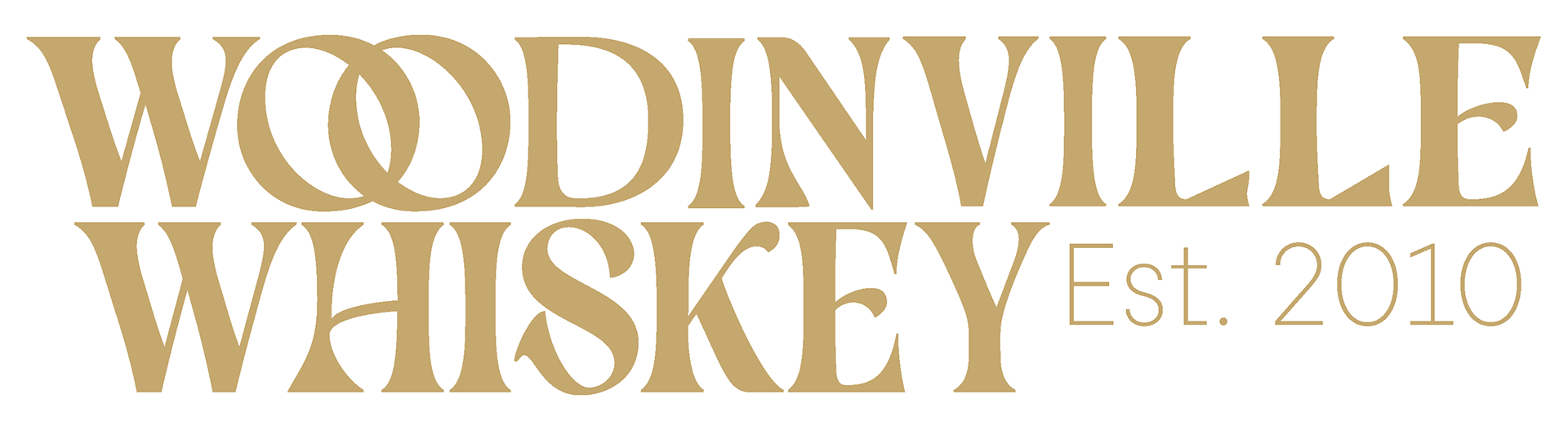
For my typography, the header Fisterra Morte was modified to feel specialized and hand crafted. Minion Pro pairs well with my header, as it mirrors much of the typeface’s anatomy. The hierarchy of information makes the design clean and clear, overall blending old-world sophistication and craftsmanship with modern-day innovation.